I can't believe my "baby" brother is 19... we are exactly ten years apart. Which means I'm almost 30 *gasp*!
Anyway, I knew I wanted to use pictures from his birthday dinner with the Jillibean Soup "Spotted Owl" soup papers from the March Artful Delight Kit.

Except the colors were bright greens and blues. And the pictures I had were very dark with reds and blacks and browns from the restaurant we were in. I still wanted to use them, but printed them all in black and white. I wasn't quite sure if I'd like it but I *love* the result.
(click to view larger)
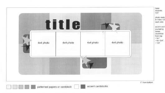
I just couldn't decide whether to use the front or the back of the patterned papers - and which ones? They are all so adorable! Then, I found a sketch from Alison Dravis, one of my favorites for double page layouts.

I cut the paper into rectangles (after some careful measuring, lol) and inked the edges in black to accent the black and white photos. I was inspired by the current challenge at Frosted Designs. So, "fussy cut" 2 of the banners from the patterned paper for my title. I popped them up, too.
I took a black sharpie to the brown journaling sprouts in the kit to coordinate with my layout a little better. The flower embellishments are from Basic Grey's Marjolaine line. Leann does such a fantastic job at putting the kits together!
Be sure to stop by the Artful Delight blog today. I believe there is just one March kit left in stock. But if not, treat yourself and order April's kit. You won't be disappointed. So far I've made 4 layouts and have PLENTY left over for 4 more.
Have a great Monday!


8 comments:
This is such a great layout!! Love the colors you picked!!
Super cute layout!!! You did a fab job with the banners!
Thanks for taking the challenge this week at Frosted Designs!
This is great Suzanne!
- April
Love your banner and papers. They are too cute. Your edges are perfectly inked. This is such an awesome LO.
Thanks for playing along at Frosted Designs.
Great layout, I love the black and white pics and the papers you chose, the banners look great cut and popped up!!
A clean and well cared artwork. Lovely colors, perfect with b/w photos. Thanks for playing with the challenge of Frosted Design
I love the colours, and especially the paper with the owls ( I have a soft spot for them). It is such a cheerful layout..
Tracy
www.thepickledowl.blogspot.com
Awesome layout! I need to come back when I'm home and save it for inspiration. I love how you used the square photos all together. Great job fussy cutting the banners too!
Post a Comment